
A huge part of the design conventions that we usually associate with a certain movie genre is determined by typography. Typography speaks to the audience as much as color palettes and familiar faces do.
If all the elements that make a poster effectively work together, then the target audience will recognize the codes of a film they want to see. This article breaks down the top 5 fonts used in the comedy genre.
The genre of comedy is wide and can take many shapes. The audience that enjoys a romantic comedy won’t necessarily laugh at a parody.
That is why designers have to distinguish comedies from other kinds of movies and differentiate the various subgenres of comedy from each other.
To do that, through the years, they have managed to mimic certain characteristics of each subgenre in the fonts used for the posters.
If you’re interested in designing movie posters, then first, you must learn to recognize these conventions because they represent the way in which things are normally done but if you are completely new to typography then start here.
Of course, conventions are only created to be then broken. So, in this article, we’ll see five of the most common trends in typography for comedy posters, and once you learn to see them, you can start making your own rules!

1. Red is for Comedy – Futura Bold
The title on a big, red bold font over a white background is such commonplace in comedy movie posters, that it even has an entry on TV Tropes (an online encyclopedia that tries to detect every single cliché ever in the world of filmmaking).
A red color, a big size, and a bold weight are three of the most effective typographic decisions to call the reader’s attention, and these posters use all three combined.
This kind of movie poster generally includes the main characters in a slightly awkward situation against a neutral light background. It does not need sound because the title visually screams at the audience.
You probably already know some examples of this trend because it’s been everywhere since the 2000s.
The most common fonts used in this trend are Futura and Impact.
The Proposal (2009) -a romantic comedy starring Sandra Bullock and Ryan Reynolds- is a perfect example with “The” in a harmless black Futura Light, but “Proposal” in a very red Futura Bold (a commercial type designed by Paul Renner).
But basically, any bold sans serif that’s not too crazy will do.
For example, American Pie (1999) has become one of the most emblematic comedies of all time, and it has like eight sequels, and everyone recognizes the logo of the saga… which just happens to be a big red Franklin Gothic Heavy font against a white background.
The font can be purchased online and was designed by Morris Benton.
Daddy Day Care (2003) and Superbad (2007) also follow this rule in their posters, the latter with a pretty original type, very similar to the free Strenuous by Typodermic Fonts.
The Boat That Rocked (2009) provides the British example, which of course, wouldn’t settle for a commoner Impact font, and uses what looks like a red ITC Serif Gothic Black instead. That font is a commercial one and was designed by Herb Lubalin and Tony DeSpigna.
The problem with this way of doing things is that after more than 20 years of tradition, it is not only used for adult comedies anymore. Many comedies targeted at children started using the big, bold red title too; Dr. Dolittle (1998), Cloudy with a Chance of Meatballs (2009), and Despicable Me (2010) provide some undeniable examples.
Some other movie posters even started using this style to mislead the audience and play with their expectations.
The main typography principle used in this concept of red over white is readability. And if the film’s target audience is not clear enough anymore, then the readability of the poster is compromised, even if the selected font is extremely legible. That is why some designers decided to subvert this trope, making a pink version slightly.
An early example of the big, bold pink title is in the poster from the film Bridget Jones’s Diary (2001), in a font called Nimbus Sans L Cond Extra Black.
Mean Girls (2004) features in its poster the old known Futura Book and Futura ExtraBlack because the geometric sans serif never fails.
Another reliable font is the Gotham Ultra, designed by Tobias Frere-Jones and used for the poster of Bridesmaids (2011).
We discuss readability and other dos and don’ts of typography here.

2. Classy is for Romcoms – Times New Roman & Co.
Let’s say you are a designer, and you want to design a poster for a romantic comedy. Obviously, you also need to edit a picture that involves the leading couple in compromising circumstances. And of course, you need your title in big, bold, and red letters on top of a clean white background.
All good but, how do you distinguish your romantic comedy poster from all the other comedy posters that kind of use the same elements? The trick is to choose a classier, more classical font.
Times New Roman, Helvetica, and Arial are not only the fonts in which you can generally deliver your academic papers; they are also quite popular in the world of romantic comedy titles.
If you are new to the world of design, it might be difficult to believe that a mild change in typography can affect the general result. But it works. Typography is one of the main elements of poster design, but there are 8 more you need to be aware of, which we discuss here.
The code of red letters over white shows that the film is a comedy at first glance. The portrayal of a couple immediately talks about a love story.
Bright colors and lighting announce that the story will not be a sad one. And of course, red is the color of love, passion, and romance, so it wouldn’t be smart to remove it from the title.
So instead of changing the color, designers change the average Futura or Impact font for a classier one (serif types are always a good idea).
That way, they let the audience know that the movie is somehow elevated from the status of regular comedy because this one is about love, and love is a classic.
The target audience of romcoms understands these conventions even if they don’t consciously know about them. They see the names of the actors and actresses (which are generally also mentioned in a very readable font, in an obvious spot of the poster), they read a classy red title, and they’re sold: they want to see it.
A beautiful example with a small variation is the poster of A Rainy Day in New York (2019), which uses the super classy Windsor Std Light Condensed font designed by Eleisha Pechey.
But this poster can allow itself to write the title in white because an open umbrella occupies most of the center of the composition, providing a convenient red canvas in an otherwise clear background.

3. Sitcoms are Special – Fonts with Personality
Legibility is crucial when you need to appeal to a target audience that will be exposed to your poster for a short time.
But what happens when you want to build an audience that will remain loyal to a long-term project? Then it would help if you showed them why this particular project is special and demands attention.
That is the case with comedy series instead of comedy movies. Series posters are different from movie posters because they’re mostly distributed digitally and are closer to regular advertisements trying to build a brand.
The most important typography principle for this kind of design is personality.
When a designer creates a new typeface, there’s a sense of how this new type will be used: is it meant for pragmatic projects that prioritize readability? Or for creative projects that are loaded with subjectivity?
The personality of the type will vary accordingly.
Regardless of the meaning of the written text itself, the font will produce a particular impression on the reader and guide the interpretation of the overall message.
Let’s see some examples of how this principle works on the posters of comedy series.
One of the most famous sitcoms in history is Friends (1994). A show set in the heart of New York that -as the name indicates- follows the lives of six friends, focusing mostly on their love life and, of course, on their friendship.
Even if the main point of the storytelling is to make the audience laugh, there are also intimate moments that have to do with love, fear, grudges, and promises.
For the first time since it ended more than a decade ago, the producers of Friends have organized a reunion special. And as it was to be expected, they didn’t dare change the classical font of the title in the posters.
The series title has always appeared in a font of handwritten style to represent that kind of intimacy that block letters lack. Gabriel Weiss’s Friends and Fred Cre’s Minus are fonts that get pretty close to the original typeface.
Another classic is That ’70s Show (1998). A period sitcom that, as it promises in the title, is set in the ‘70s and focuses on a group of teenagers.
The font used for the logo is called Arnold Böcklin and was created at the beginning of the 20th century.
Why was this old Art Nouveau style font chosen for a show made in the ‘90s that talks about the ‘70s? Because the Art Nouveau design saw a revival during the age of flower power, it was perfect to represent the show’s personality. Designers are kind of underpaid detectives, aren’t they? This leads us to our next, more contemporary example…
Brooklyn Nine-Nine (2013) is a sitcom from Fox that revolves around the police officers of the 99th Precinct of the NYPD. It is mostly centered on humor, but it also involves a lot of action.
Therefore, the fonts used for the title in the poster are an obliqued derivation of Impact and what looks like Helvetica 86 Heavy Italic, both fonts that represent dynamism and suggest movement.
The designer also chose a shocking yellow color that helps highlight the active personality.
Friends might be famous, but the most beloved sitcom of all time is probably The Office (US version, 2005). Proof of that is that it was by far the most streamed tv show in 2020, even though it ended in 2013.
The show is about the daily work (and mostly not-work) of the employees of an office from a paper company in Scranton.
The show producers wanted the protagonist to look like anyone’s boss, the set to look like anyone’s office. Therefore the designers used a font in the title that could have been used in just about any official document.
American Typewriter Medium is a commercial serif typeface created by Joel Kaden and Tony Stan, and it has the perfect personality for an office.
4. Comedy-dramas are Personal – Handwritten Fonts
Films that belong to the comedy-drama genre tend to explore life from the perspective of one particular character that’s generally dealing with a bittersweet situation.
These movies are overall funny and bring up heavy subjects such as death, heartbreak, or the transition to adulthood. The stories they tell are deeply human and personal, so designers often go for a font in handwritten style for the movie poster.
They choose a font that doesn’t seem to have been written by just any machine but by a person’s hand instead.
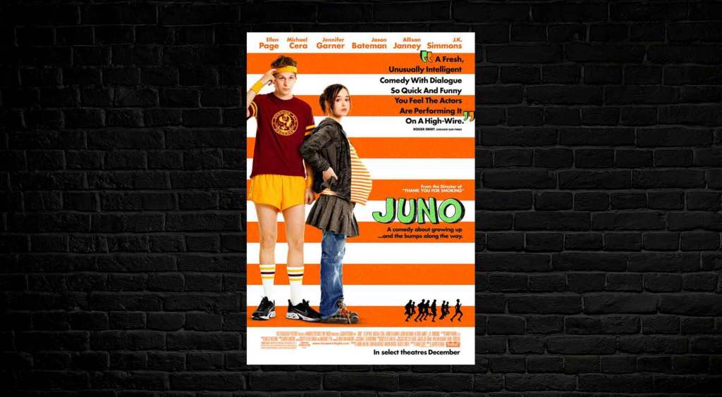
A charming example appears in the poster of Juno (2007), a film about a quirky teenager that ends up being pregnant and suddenly has to grow up much faster than planned.
That type was drawn by Jenny Lee for the title in the poster and was also animated in the film’s intro. It’s a font based on the doodles the designer used to make in her own high school notebooks.
From that first version of the font, Jenny Lee and her husband Gareth Smith created WiggleType, a project of handmade animated typography that currently has the Kaylee and the Pocket typefaces available.
Moonrise Kingdom (2012) is a lovely story about two kids that decide to run away together, and as always in all films by Wes Anderson, the art of the movie is incredibly aesthetic and detailed.
The cursive lettering that was chosen for the title in the poster is a little too perfect not to look computer-made, but it’s still much more personal than any font with block letters.
The font is close enough to Tilda, a typeface designed by Jessica Hische, who actually took inspiration from another movie poster, the one from La Femme Infidèle (1969).
Lady Bird (2017) is a coming-of-age film about a teenage girl trying to find her way in the world. The movie has made many waves since it first was released, given how famous Saoirse Ronan and Timothée Chalamet have become.
But at the time, it was conceived as an indie film that didn’t need to follow all the pre-established rules, which was perfectly reflected on its poster.
The font used for the title was Amador, a typeface designed by Jim Perkinson in a gothic style (which, as unbelievable as it may sound today, is actually just a modern revision of how monks used to write books by hand in the Middle Ages).
To All the Boys I’ve Loved Before (2018) is mostly a romantic comedy, but it has some really sad undertones because the protagonists are dealing with trauma such as the death of a mother or the absence of an abandoning father.
The story revolves around a teenage girl that writes letters, so of course, the handwritten font for the poster was a no-brainer. The designer chose the typeface Have Heart, by Sam Parrett, and did not disappoint!

5. What About Horror Comedies?
The Babysitter (2017) is a parody of a horror movie that follows the events of the nightmarish evening in which a preteen boy discovers that his babysitter is the leader of a murderous satanic cult.
I couldn’t find the exact font that was used for the title in the movie poster. Still, it’s obviously a classy tribute to how horror movie posters used to be made when teens still had babysitters (with examples such as Halloween (1978) and Braindead (1992).
Zombieland: Double Tap (2019) is the sequel to the film Zombieland (2009), a movie that parodies all zombie-themed and post-apocalyptic movies.
The commercial font used for the title in the posters was designed by Max Miedinger and Edouard Hoffmann, and it has the long name Neue Helvetica Paneuropean 87 Condensed Heavy.
The poster designers took the trouble to edit this font with added effects so that it would remind the audience of an amusement park, but a sort of deteriorated one, because that’s exactly where the climax of the first film takes place.
Scary Movie (2000) was the first of a long list of movies that simply mashed up the arguments of many other movies in vogue to create a horror-comedy parody. (If you are looking for fonts that belong in the straight-up horror genre, then you need to check this out.)
The poster of the first film included elements belonging to most of the parodied movies. Still, it had a straightforward way of telling the audience that this was, in fact, a comedy: it portrayed the protagonists in a slightly awkward situation, and it threw on top a big, red, bold title typed in Futura Extra Black.
What about the other genres?
We got you covered. Check these out:
- Top 5 Fonts Used in Thriller & Suspense Movie Posters
- Top 7 Fonts Used in Drama Movie Posters
- Top 5 Fonts Used in Science Fiction Movie Posters
- Top 7 Fonts Used in Romance Movie Posters
- Top 5 Fonts Used in Horror Movie Posters
- Top 10 Fonts Used in Action Movie Posters
Font Conclusion
The moral of the story is that conventions can be followed, bent, or completely abandoned according to the needs of the design. We discuss this in the following articles:
- 6 Most Important Typography Principles | Movie Posters
- The 9 Worst Mistakes Movie Poster Artists & Designers Make
Sometimes the font used for the title in the poster of a comedy needs a whole new concept, sometimes it needs to serve as a homage, and sometimes it can just go for the simplest of trends.
And speaking of trends, are you looking to become the next trendy designer, perhaps a movie poster creator, or just want to improve your art and design skills? The cool thing is that we are creating an online tutorial program that teaches design principles focused on entertainment marketing, aka movie and TV posters.
If this interests you, then sign up for our newsletter, as subscribers will be the first to be notified. Don’t worry; we don’t spam unnecessary content!
Oh yeah, check out our free YouTube tutorials on typography and poster design today!